Nediam Consultants
Nediam Consultants produces events for BET, Cartier, and Microsoft. Their website didn't show it.
Brand Strategy
Logo Design
Business Collateral
Website Design & Development
Website Copywriting
WHAT I DID
The Challenge
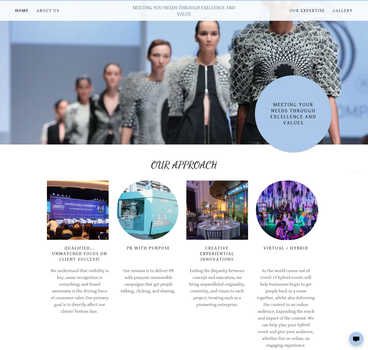
When I first looked at Nediam's digital presence, the gap between reputation and presentation was clear. Their GoDaddy-generated site had a typo in the main tagline ("EXELLENCE"), a mix of stock imagery and actual event photos that lacked context, and typography that couldn't decide between script and sans-serif.
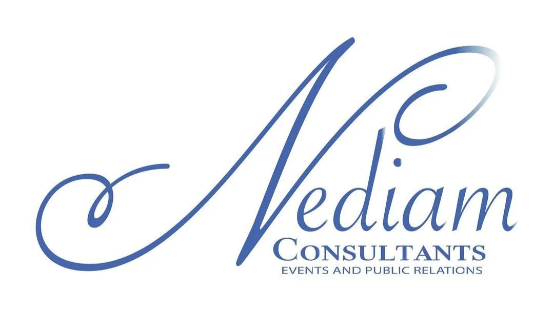
The old logo — a decorative script with gradient flourishes — read “wedding planner," not "we've executed global conferences and brand activations for Fortune 500 clients." For a firm winning government contracts and luxury brand partnerships, the visual identity wasn't matching the work.
The Approach
I started with a brand questionnaire to understand how Kadrieka wanted Nediam to show up — bold blues and purples, energy that conveyed "joy, fun, special occasions" while still commanding corporate respect. From there, I developed five distinct logo concepts, each with clear rationale:
-

Cut Out
Negative space play with C formed inside the N
-

Tradicional
Classic serif energy with NC monogram
-

Deco
Art Deco-inspired with aerodynamic curves and line art
-

Jaunty
Dynamic NC with diagonal N breaking through circle, energetic typography (Gotham)
-

Cerious
Same dynamic NC logomark, sleeker typography (Code Pro)
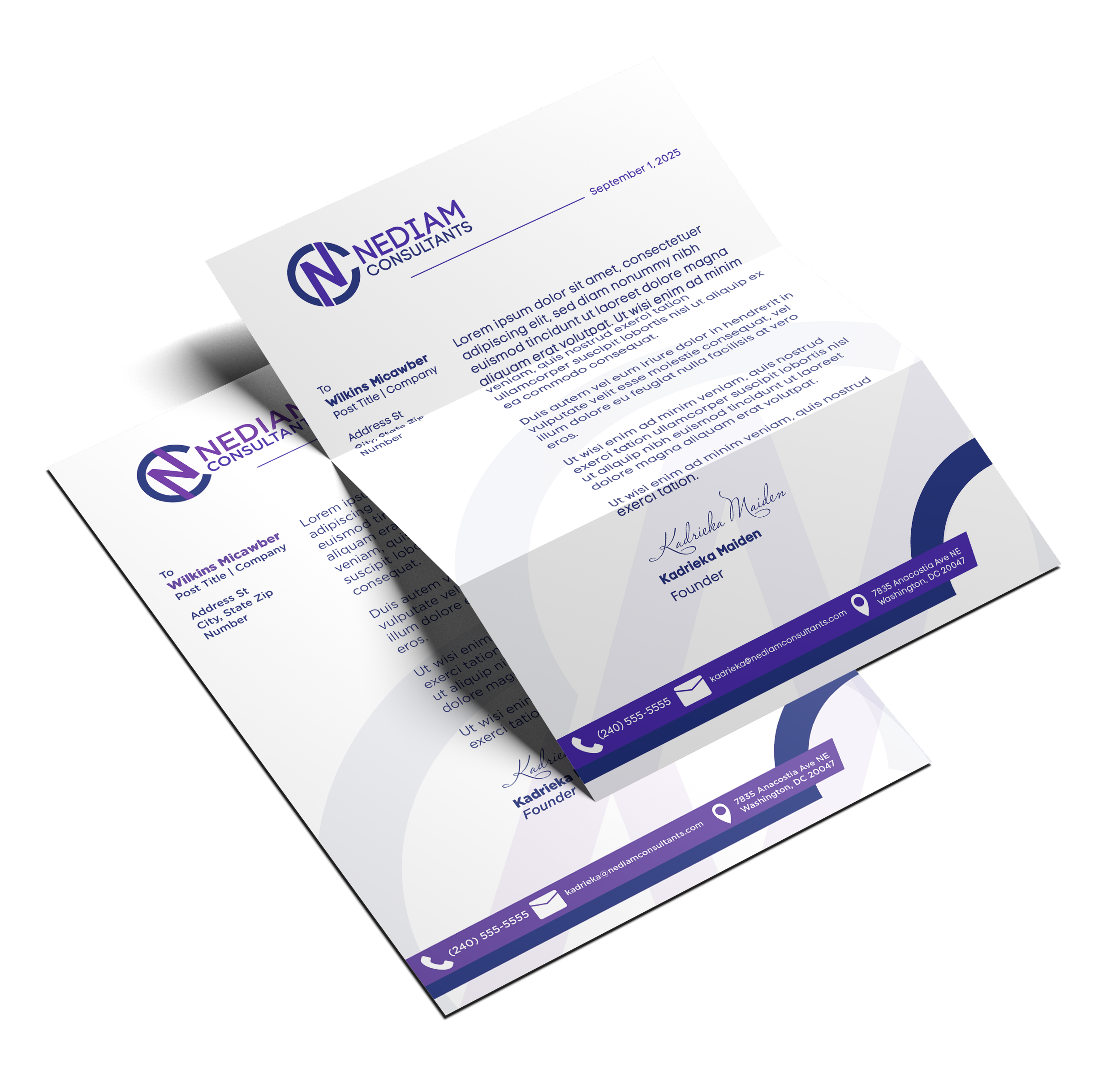
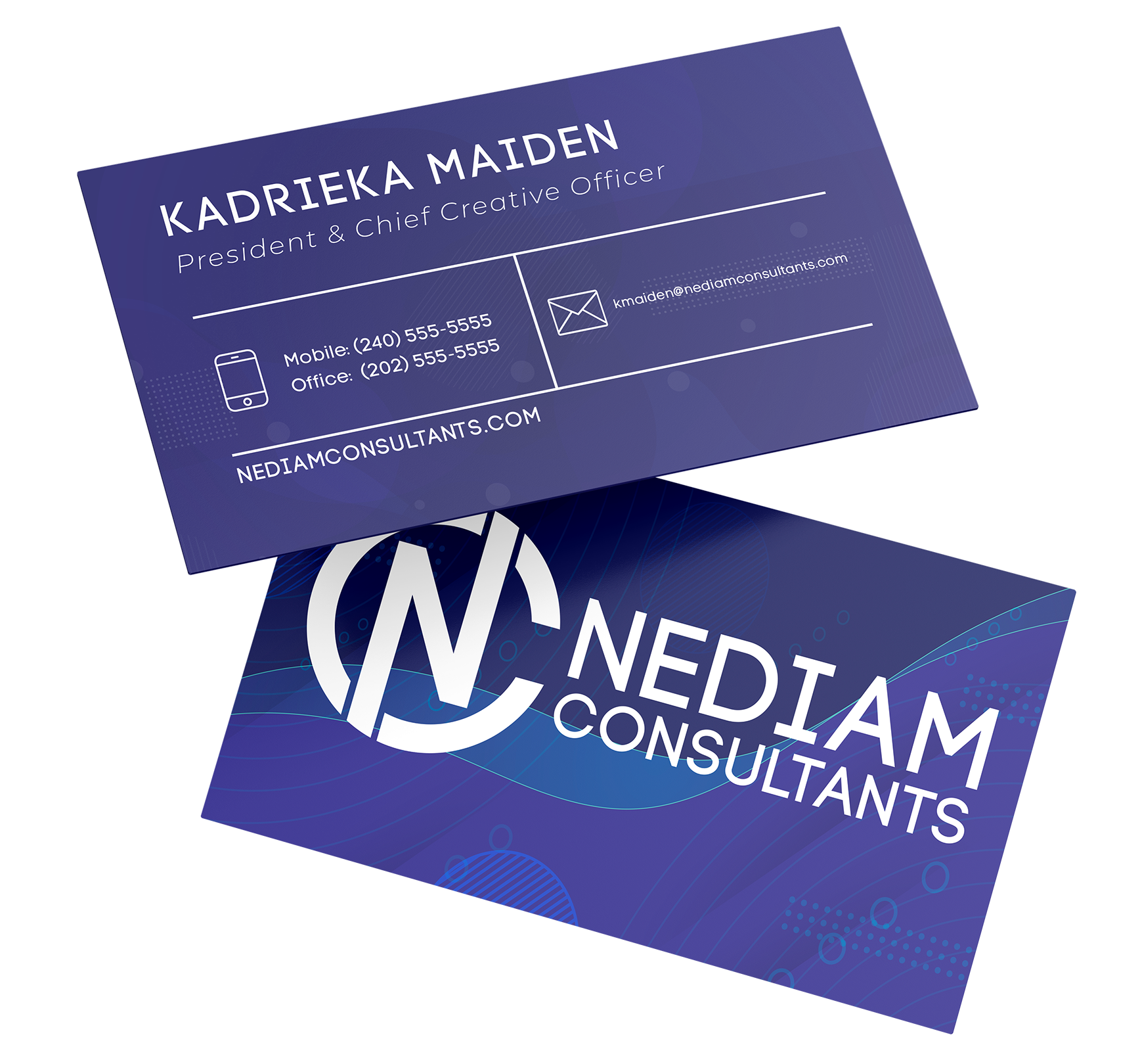
Kadrieka selected both Jaunty and Cerious — same logomark, different typography — giving Nediam flexibility to match tone to context. The NC monogram features a diagonal N breaking through the circle boundary, suggesting forward momentum and the kind of energy that makes events happen.
The website rebuild moved to Squarespace, where I implemented custom interactions: three scrolling video heroes on the homepage, floating images that resize on scroll in the portfolio sections. The client roster became prominently visible. Real testimonials from DC Dept of Transportation, Blavity Inc., and Afriplus Global established credibility immediately. The copy got specific about what Nediam actually does.
The Work
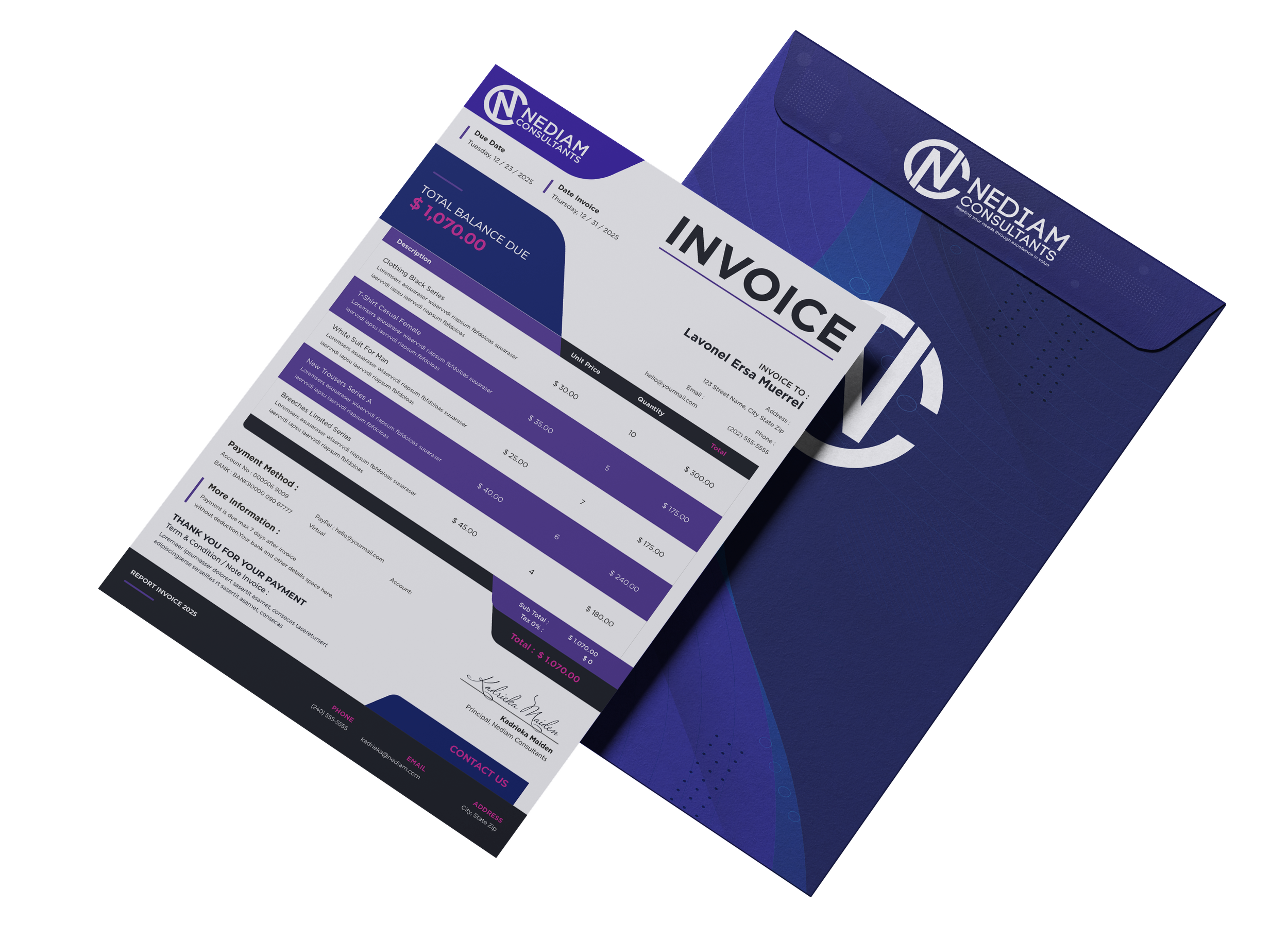
Logo system with dual typography variants, business cards for multiple team members, letterhead and invoice templates, complete website redesign with custom scroll interactions.
The Impact
Nediam now presents at the level they perform. The brand system works across contexts — Jaunty for event marketing energy, Cerious for polished government proposals. The website showcases their actual client roster (Tiffany, ONSE, DDOT, BET, Cartier, Microsoft, ColorComm) instead of hiding it. Kadrieka has collateral she's proud to hand out.
The Takeaway
Sometimes the best design work is closing the gap between how good a company actually is and how good they look.