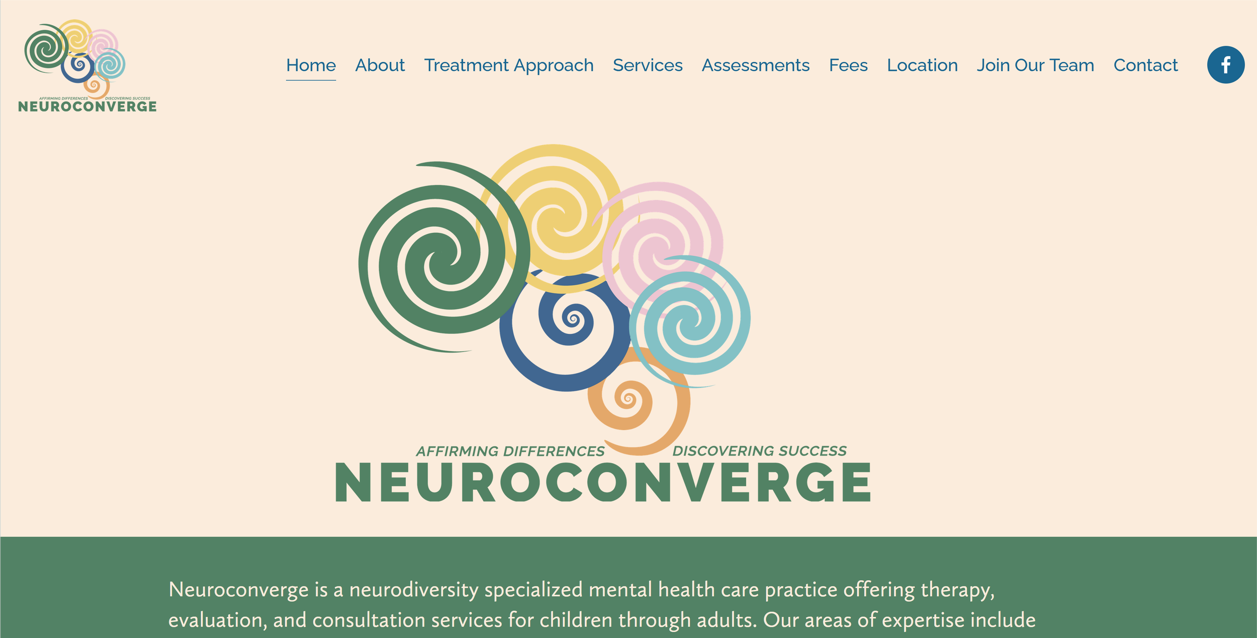
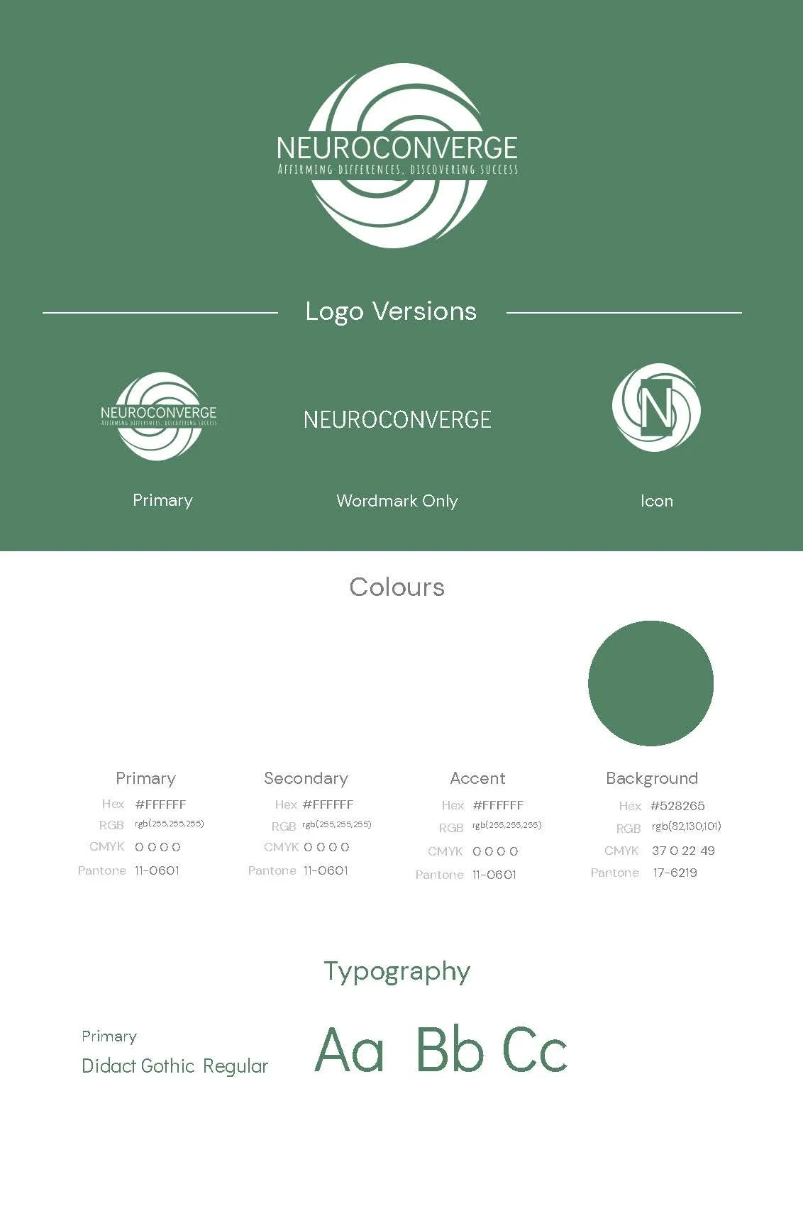
Neuroconverge
A mental health practice serving ages 6 to 60+ needed a brand that could do the same.
Brand Strategy
Logo Design
Color Palette Development
Web Design & Development
WHAT I DID
The Challenge
Neuroconverge is a neurodiversity-focused mental health practice — therapy and assessments for ADHD, autism, and related conditions across the full age spectrum.
Julie came to me after trying a logo generator. The result was a generic spiral mark and a "brand board" so incomplete that three of the four color swatches were just white.
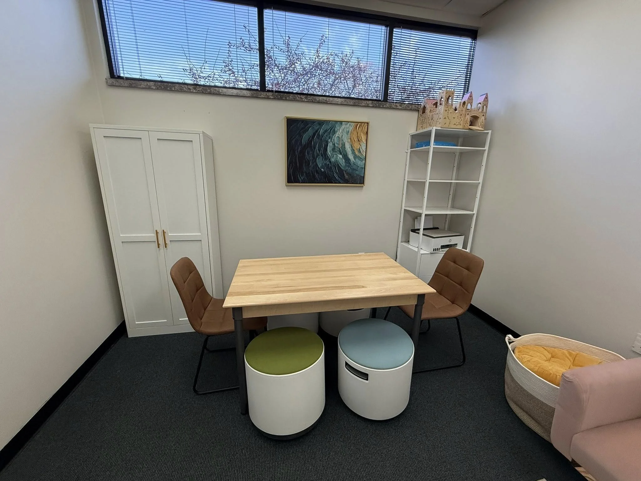
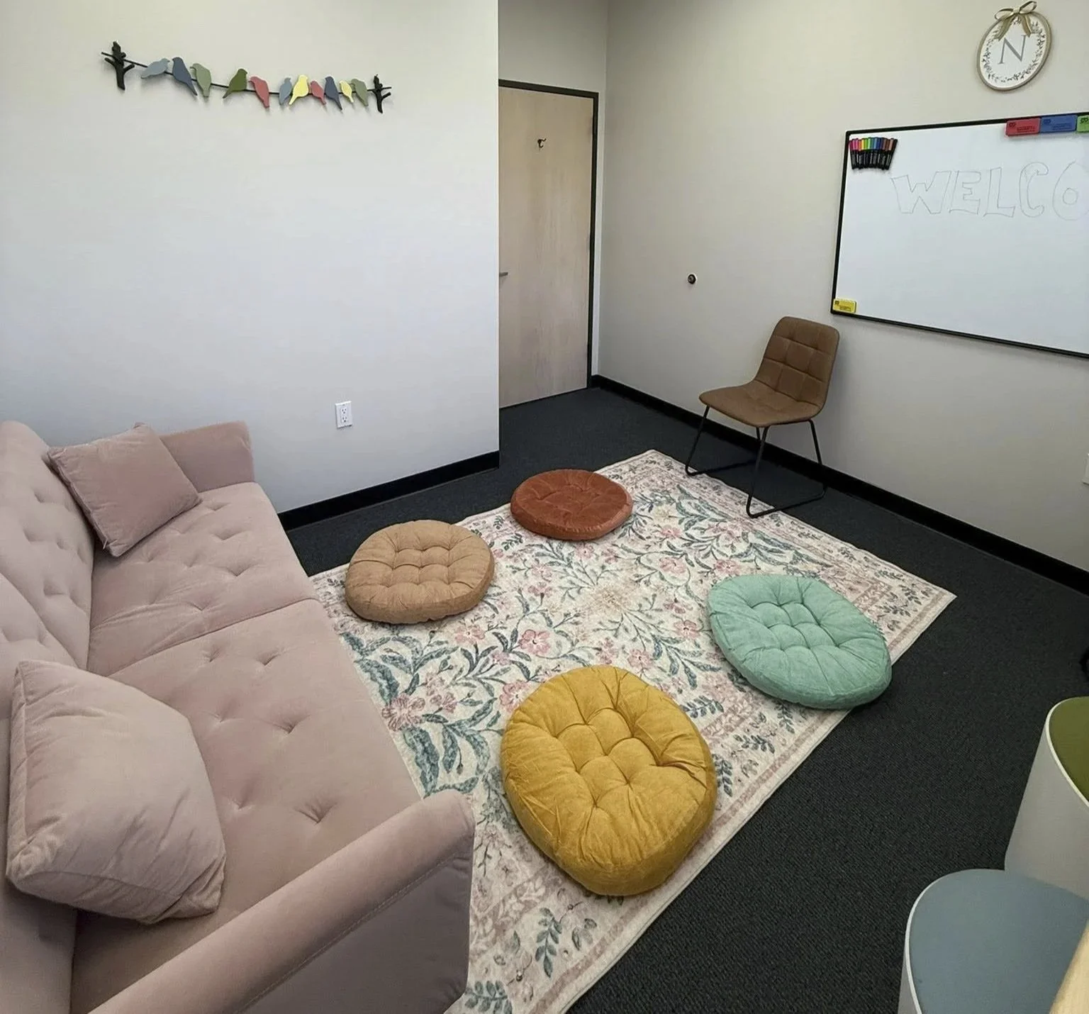
She needed a brand that felt professional enough for referral partnerships and insurance panels, but approachable enough that a six-year-old wouldn't feel intimidated walking in the door.
The Approach
I started where I always start: listening
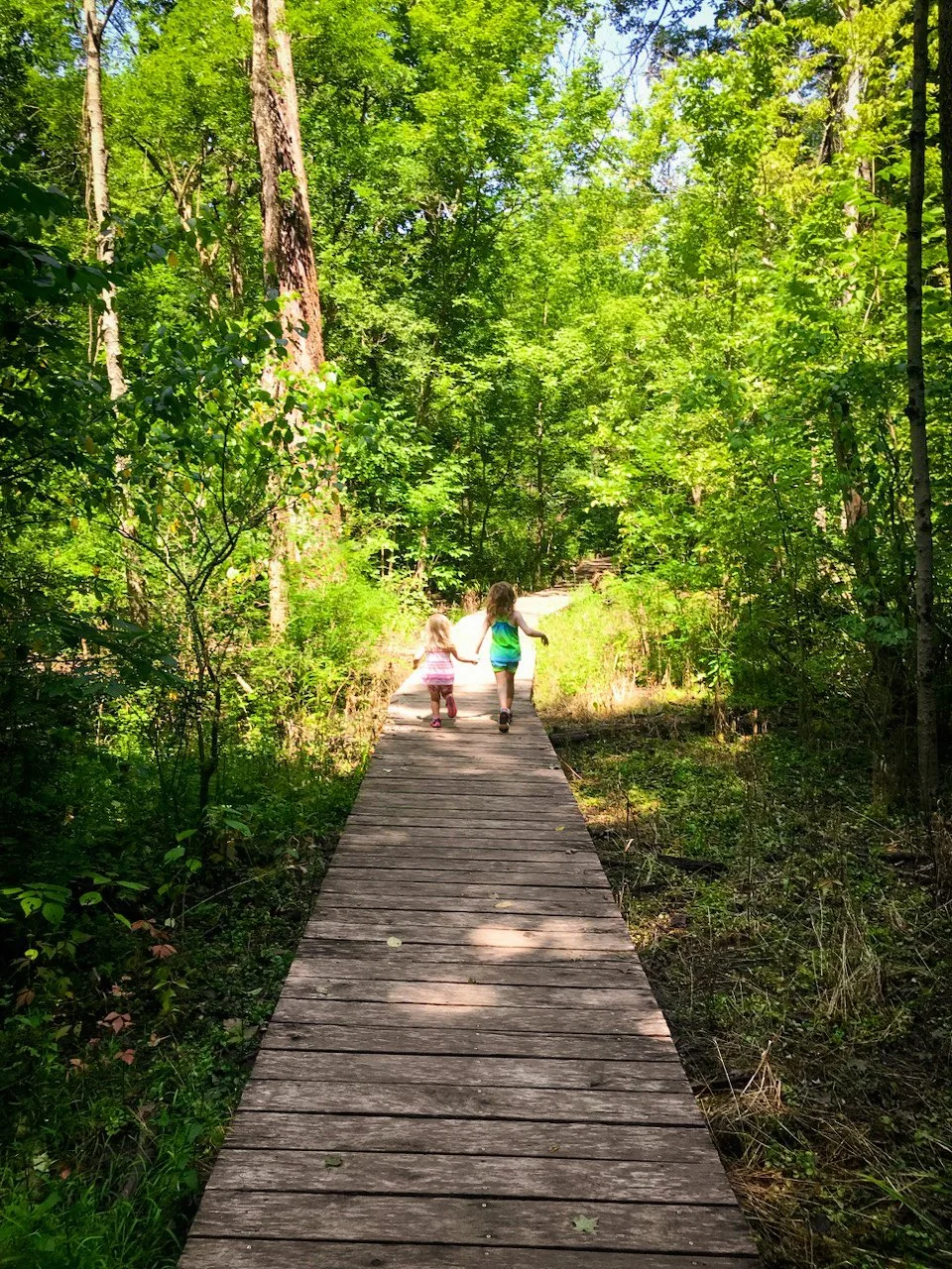
Through our discovery conversation, I learned about Julie's personal connection to neurodiversity and her vision for the practice. She shared photos of her daughters hiking and together at sunset as well as a painting she loved.
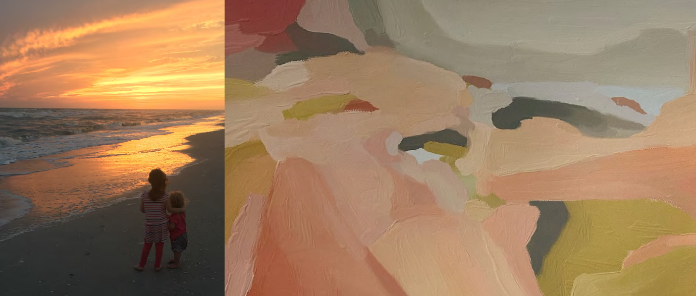
I built the entire color palette from those sources — Hooker's Green as the anchor, then Fawn, Hansa, Orchid Pink, Lapis Lazuli, Dark Sky Blue, and more, all pulled directly from images that meant something to her.

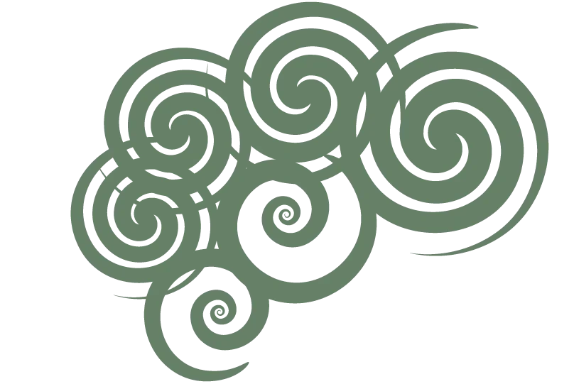
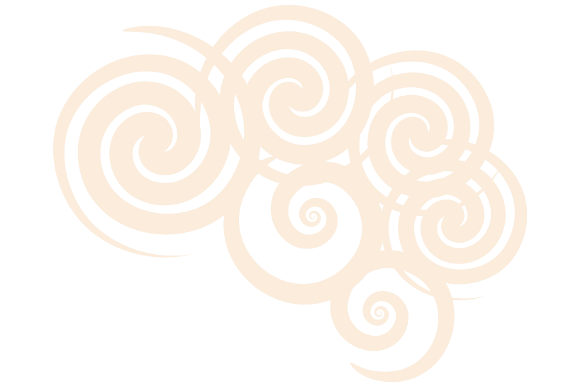
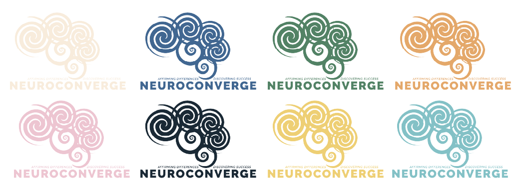
The name Neuroconverge pointed toward a central motif: converging spirals.
I wanted that visual thread present in every concept, interpreted differently each time.
From there, I developed four distinct directions:
-

Spirangle
Sharp, dynamic blades forming a pinwheel spiral. Energetic and modern.
-

Brainiac
A literal brain shape filled with various spiral patterns. Direct and illustrative.
-

Dottie
Dots arranged in converging spiral formations with gradient colors. Playful but abstract.
-

Play
Converging spirals forming an abstract brain shape. Organic, approachable, and versatile.
The Work
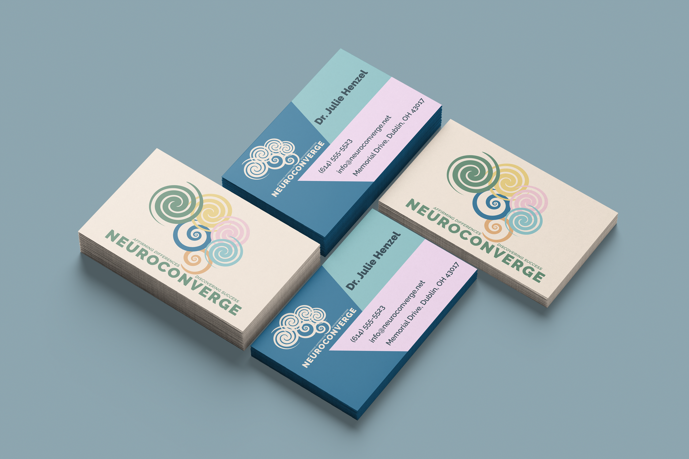
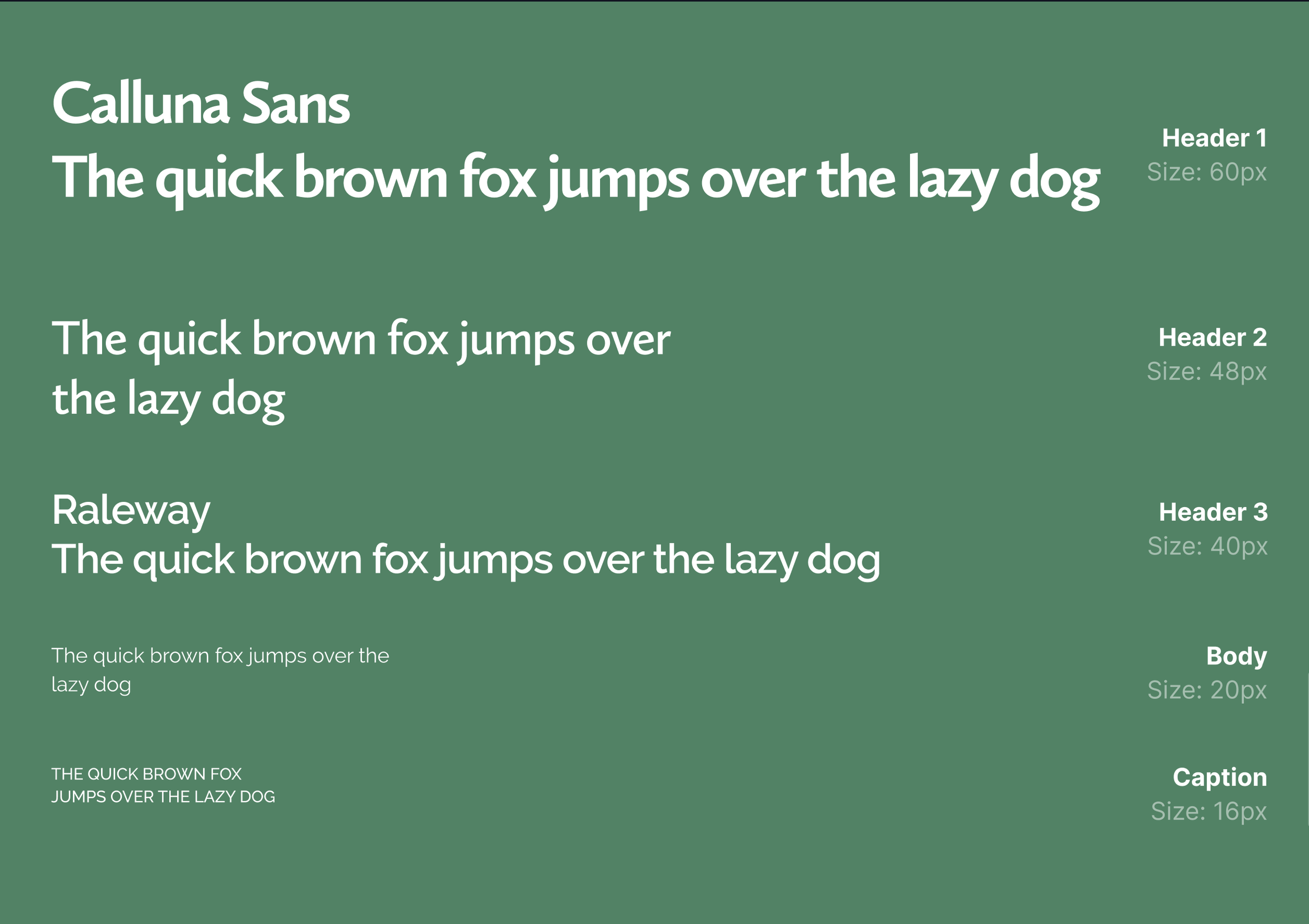
Logo system with color variants, brand color palette derived from personal touchstones, typography selection, website design and development.

The Impact
Neuroconverge now has a complete brand system that serves patients ages 6 to 60+. It's professional enough to build referral partnerships, playful enough for kids, and distinctive enough to stand out in a field full of generic "brain + heart" logos.
The Takeaway
Good branding starts with listening.